
I was surprised when I first heard Jeremih’s “All the Time” featuring Natasha Mosley and Lil Wayne on KMEL. The song had a behind-the-beat feel, which, combined with its earth-shaking fifty-five beats per minute tempo, made it quite tasty — all from the guy who made this song five years ago.
The part that intrigued me most was Natasha Mosley’s lyric: “I could love* you all the ti-i-i-i-i-i-i-i-i-i-i-i-i-ime.”
Note: Don’t click play if there are children present.
I had a sneaking suspicion that there was some rhythmic trickery going on here. I had to dig a bit deeper.
The goal: Determine if, and to what degree, any parts of “All the Time” aren’t rhythmically accurate.
First we’ll need some data.
We’ll use Audacity‘s Sample Data Export script (Analyze -> Sample Data Export…) to export the region of interest — Mosley’s lyric — above to a text file. The pre-execute options menu asks for “decibels” or “linear.” We don’t care about units — just relative measurement. The “linear” options gives us amplitude values on a -1 to 1 scale (easy) so let’s go with that.
Now we can analyze some stuff! I’m learning Python so that’s what we’ll use. Feel free to follow along by downloading this text file with the raw data. You can follow line-by-line by opening up your terminal, typing “python”, and copying all the code in as you read it. Alternatively, grab the full working script.
We’ll need numpy for math and pyplot for plotting.
import numpy as np
import matplotlib.pyplot as plt
Now let’s load the data!
data = np.loadtxt('jeremih.txt')
This gives us an Nx4 array with columns: time, left channel amplitude, time, right channel amplitude. N is the number of samples — 148582 in this case.
We don’t care about the difference between left and right channels, so let’s make an Nx2 array where the second column is the average of the left and right channels.
amp_vs_time = [[row[0], np.mean(row[1], row[3])] for row in data]
We need the transpose of this data — a 2xN array, where the first row is all the time values and the second row is all the amplitude values.
amp_vs_time = np.transpose(amp_vs_time)
Cool. Let’s see what this looks like.
plt.plot(amp_vs_time[0], amp_vs_time[1])
plt.show()
This gives us a nice plot with time on the x-axis and amplitude on the y-axis. Again, the amplitude units are totally arbitrary — just looking for peaks here. Furthermore, we’ll only look at positive y-values since the negative y-values basically mirror the positives.
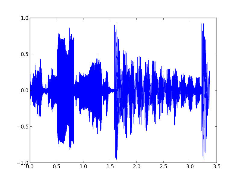
The part of this plot that corresponds to “ti-i-i-i-i-i-i-i-i-i-i-i-i-ime” starts at the big peak around 1.6 s.
We need to find out where the downbeats are in this sample data for reference. From watching the song play in Audacity, we can figure out that the big bass notes — the big peaks around at 1.6 s and 3.3 s — are on beat one and the and of beat two.
We need to figure out the exact time of the beginning of those peaks, so we can write a function.
def t_of_first_peak_in_range(min_t, max_t):
  for i in range(len(amp_vs_time[0])):
  t = amp_vs_time[0][i]
  if min_t < t < max_t and amp_vs_time[1][i] > 0.5:
    return t
Now we can call this function using the ranges where we know these peaks are as arguments.
beat_one = t_of_first_peak_in_range(1.5, 2)
beat_two_and = t_of_first_peak_in_range(3, 3.5)
Now that we know the exact times of beat one and the and of two, we can determine where the thirty-second notes corresponding to Natasha Mosley’s lyric: “ti-i-i-i-i-i-i-i-i-i-i-i-i-ime” should be. There are twelve thirty-second notes in one-and-a-half beats, and we need to include the and of beat two — thirteen notes in all.
thirtysecond_notes = np.linspace(beat_one, beat_two_and, 13)
Let’s plot this!
plt.plot(amp_vs_time[0], amp_vs_time[1])
plt.vlines(thirtysecond_notes, -1, 1, color='red')
plt.show()

The red lines show the accurate placement of thirty-second notes. The blue peaks in between each red line show the placement of Mosley’s notes — a bit behind! If Mosley’s notes were accurate, we would expect the initial spikes for each note to line up with the red lines.
Furthermore, it doesn’t look like Mosley is slow — just behind. The time from note-to-note is just as it should be — one thirty-second note. It looks like she starts behind on beat one and stays there.
So how behind is she?
Let’s look at the second thirty-second note — right around 1.7 s, since the first one is lost in the bass noise.
rec_rhythm_diff = second_thirtysecond_rec - thirtysecond_notes[1]
print ('Offset (s): ' + str(rec_rhythm_diff) + ' s')

percent_offset = rec_rhythm_diff / (thirtysecond_notes[1]
    - thirtysecond_notes[0])
print('Percent offset: ' + str(percent_offset * 100) + '%')
This outputs the following.
Offset (s): 0.02785 s
Percent offset: 20.4238779701%
I think it’s safe to say that this is intentional. Rap producers have it well within their means to shift rhythms around however they please. Furthermore, the whole song has this feel — not just this one lyric I chose to analyze. Lil Wayne has always exhibited loose rhythmic interpretation in his raps, and continues to do so in this song.
Still, many questions arise. Did someone just turn a vocal delay knob to 20%? Is 0.03 seconds the magic number to make a vocal track sound behind without sounding wrong? Who was the creative mind behind this song’s behind-the-beat feel?
Whatever the creative process may be, the result is pretty awesome. At a time when the creation of popular music is akin to using a ruler to draw straight lines on a piece of graph paper, it’s refreshing to hear some artistic interpretation of rhythms. If anything, it’s a nice reminder that music produced on computers doesn’t have to sound like it was made by robots.
*Clean version. It’s not “love” you all the time.
